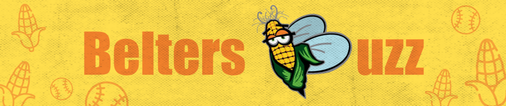
This is the logo for the new email newsletter for the Cornbelters. We discussed and voted on names for the newsletter with the whole office and other interns, and we settled on “The Belters Buzz.” As I drew up some draft sketches, I tried keeping to the style of the original Cornbelters logo, which is a bit cartoony. I also wanted to include some sort of reference to corn and a bee (buzz). I decided to make the corn from the Cornbelters logo look like a bee, while also tweaking it to form the “B” in “Buzz.” I put that on a yellow background and experimented with various layouts and designs. It was a good challenge trying to find a good balance between fonts, icons, and spacing. We ended up going with a banner that had both corn and baseball icons in the background.