
For this project, I made an animated postcard for Kyoto, Japan. Using Adobe Illustrator I made the graphics based on my sketches. Then, I put them all together and animated it to look like it’s popping up like a storybook in Adobe After Effects.
My Process
I did research on popular tourist locations and what made Japan and Kyoto unique. I wanted to focus on easily recognizable shapes and colors. Kyoto is famous for its temples, gardens, and nature. I compiled a lot of reference images that included these structures so I could get a better grasp of their shapes and how they would fit together naturally in a postcard, but also stay true to Kyoto itself.
I made various thumbnail sketches of possible ideas that I could do, but I felt that what I was sketching at this point was really limited and only focused on one particular location. Postcards are supposed to attract tourists by showing off what the place has to offer, and I think this is done best when it shows more than one place, so that tourists have variety.
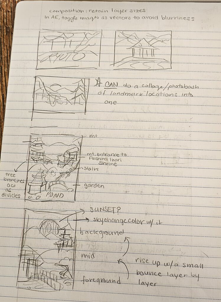
Obviously, not everything could be included, as there has to be a balance, so I chose landmarks that I thought would work best together in a collage sort of style. I decided that the postcard would be layered into three distinct sections, also switching to a vertical canvas to better fit. The first layer would represent the gardens in Kyoto. This layer has a red bridge, the famous Torii gates, and a pond. Although this particular location is not real, it was a combination of various gardens. The second layer would start to show the big hills and mountains, the cherry blossom trees, and one of their famous temples. Finally, the third layer would be the mountain skyline with a sunrise, as Japan is known as the “Land of the Rising Sun.”
I took these sketches and recreated them in Adobe XD first, so that I could correctly make the shapes based on the references, but also because I felt most comfortable using this program compared to Illustrator.


I made the layout that I wanted, finally incorporating color. I stuck to green, pink, red, and gray. I partially regret starting out in Adobe XD first and then going to Illustrator. It was good that I could make the main shapes and put them in the correct layout, but once I imported it into Illustrator, I ended up basically redoing most of the shapes I made. So it was mostly a waste of time, but at least it gave me a better picture of how I wanted it to look other than my sketch.
During that time, I had barely used Illustrator since my sophomore year, so I was very rusty in working in Illustrator. I ended up having to constantly lookup guides on how to use certain tools, which also contributed to an unnecessarily longer work time. I also added a lot more detail that I should have, and although it looks really cool in the final product, I don’t think it was worth the time and effort. The ones with the most details were the cherry blossom trees and the temple, and when I scaled these detailed objects onto the final postcard, the details were harder to see because of the size. I also felt that the huge difference in details in the trees and temple compared to everything else was very unbalanced and made the postcard look a bit weird (to me). Though, I decided to keep them that way because I spent so much time making them that it would be a waste to get rid of them.