
For this project, I needed to create multiple animated patterns that represent a part of myself or are important to me. I decided on referencing toys and games from my childhood. I used Adobe XD to draft a mock-up of the general idea and layouts before moving to Adobe Illustrator to create the SVG graphics. Finally, I animated these graphics in Adobe After Effects, resulting in five different animations.
In the room where the class was being held, there are hexagon-shaped sound-proofing decor on the walls. My professor took our projects and projected them onto each hexagon, which made for a really interesting visual effect.
Wall Projection
My Process
During brainstorming, I found it hard to visualize a pattern that could be animated that also was connected to me through memory, personal experience, or culture. I was being too rigid in this thought process, and came up with, what I believe to be, a more complicated “pattern,” as when we did a check-in and people were testing projecting their patterns, I realized that I was overthinking when I was designing my patterns. Though I am very satisfied with how they came out, I felt a bit embarrassed showing them due to how different they were compared to my peers’.
So, in my own convoluted thought-process, I believed it made the most sense to reference things, primarily toys, from my childhood. This was because I could reference the exact colors, themes, AND patterns from their own marketing and commercials to base my own on. I made a list of toys that were my favorites as a child, eventually also adding in games, video games, and food. I ended up choosing Zoopals, Jenga, Minecraft, friendship bracelets, and Kool-Aid for my patterns. I initially had sequins instead of Kool-Aid, a reference to the many sequined clothes I wore, but I couldn’t figure out how to animate the sequins so I switched.
When making my actually “sketches” for the patterns, I went directly to Adobe XD to make them, so that I could easily compare and reference the online images side to side with the patterns, mostly to get the scale and colors correct, and that I didn’t see the need to physically sketch these basic shapes on paper. I used this to plan out the general layout, design, and colors of the patterns before moving to Adobe Illustrator.
When searching for references, I realized that my memory of these items are very different from how they actually were. Mainly with Zoopals, because I did not remember there being that many types of animal plates! They also apparently had themed forks and spoons (my mom found one of them recently in the kitchen)! When I went to animate the plates, I looked up the commercial, and the way the plates moved were different from how I remembered. I initially thought they moved in a side-to-side sway motion, while also jumping in a direction, but it turns out they jumped in relation to the jingle’s lyrics. Since the projection wouldn’t have audio, I decided to combine both these animation ideas, having the plated “jump” in an arc motion in one direction, with a delay between each plate. I would also have the three rows go in different directions, so the top and bottom would go the same way, while the middle row would go the opposite. It was also more practical, as without the audio, having the plates jump to the beat of the lyrics is lost in the projection, but also because I did not want to try to sync it up in the animation (haha).
I made the final plate assets in Illustrator. I used the pen tool and traced over the images of the plates to get the proportions right, and then adjusted them.
When I animated them, I spent the most time adjusting the timing of the plates, because after I animated one plate, I copy and pasted the animation to all the other plates in its row.
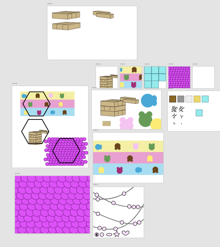
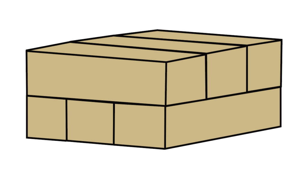
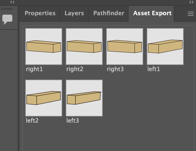
When I moved onto the Jenga blocks, I was confident that it would be the easiest, as they were just rectangular prisms, but then I had a lot of problems with aligning them. Since, when they’re animated, the blocks are supposed to slide into place on top of each other, and I had some difficulty with making the perspective match for the animation. I did finally figure it out, but it took a lot of tiny adjustments for it to look right. The Jenga blocks were also the easiest to animated, as all I had to do was have them slide horizontally into position. I did spend some time trying to figure out how to loop it, but I figured it out pretty quick. All I did was animated the the left facing blocks slide in and move down, and then the right blocks sliding in and then moving down. I put the final position at the end before animating so that it would always exactly end up where it started.
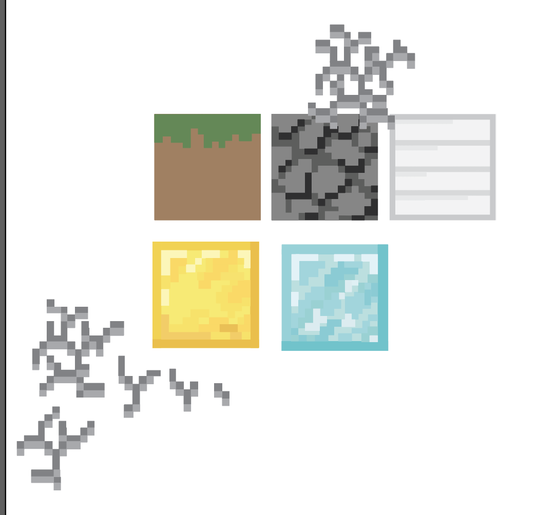
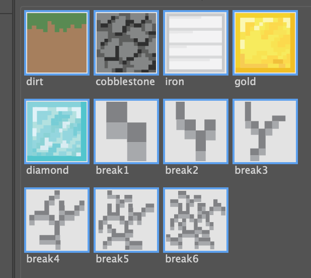
The third pattern was based on Minecraft, which I used to play a lot of when I was a kid. I still do, but not as much as before. I wanted to show the progression of game play from starting with dirt to being rich with diamonds. I based each block initially on the old original textures, but I ended up going with the texture that was easily recognizable and different from each other. The original iron, gold, and diamond block textures were identical other than color. I tried to keep the designs simple and to a minimum, as you wouldn’t be able to see it anyway when it was animated, but to be honest, I could’ve just used the actual PNG’s of the blocks but I didn’t think of that then. I traced over the images to get the general shapes of the blocks and the crack animation before adjusting the colors and placement to my preference.
When it came to animation, I had the blocks aligned in a 3×3 layout, with each block popping up over a previously destroyed block, and the breaking animation following. Starting from the top left and ending in the bottom right, the animation for each block would be delayed by one breaking frame from the one before it. After a block was broken, the next block from progression would take its place, in a pop-up animation similar to the one from the postcard.
I animated the animation of one block by itself, and then imported that animation onto a bigger canvas and assembled the single animation into the 3×3 layout. In the final animation, I left out the cobblestone because you couldn’t see the break animation on it due to the colors I chose.

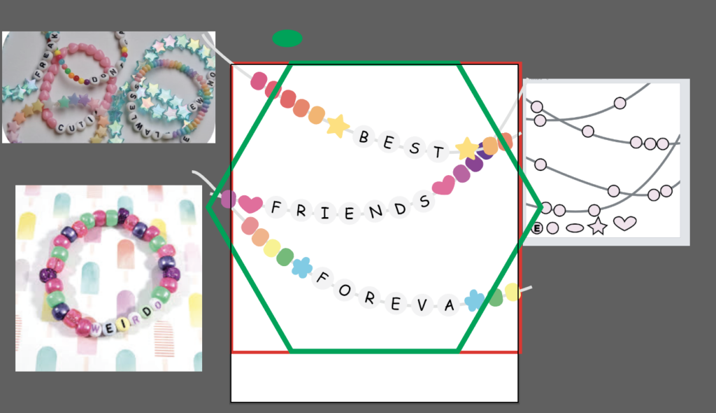
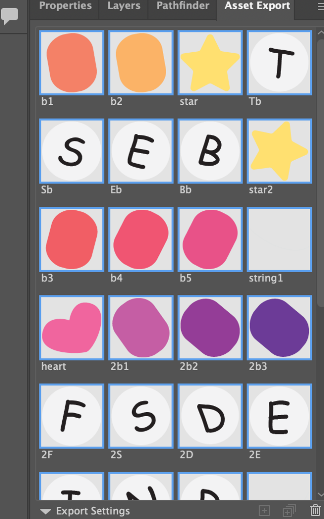
For the friendship bracelet, I made one main bead shape using a rectangle with rounded edges. I then made three unique shapes, a star, heart, and flower, to be used on each string for variation. The last bead type was the letter beads, which were just white circles with the letters in comic sans to look more childlike.
I arranged the beads on the strings I laid out, trying to keep a balance of white space. There were three sections, one for each word of “Best Friends Foreva.” After I was satisfied with the placement, I added color. I wanted it to be bright and colorful, but I also wanted there to be variation between each bracelet. I used gradients for the first two bracelets, and then a rainbow for the third.
I exported each bead individually so that they could be animated independently. All I had to do for the animation was have the slide into their final positions along the string. I utilized the pen tool to make and adjust the arcs. It was easy, but due to the number of beads, it was a little time consuming since I also had to adjust their arcs.
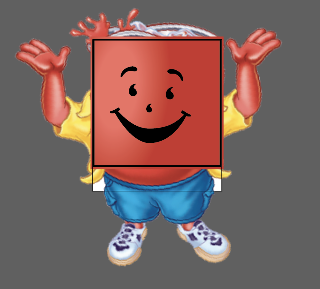
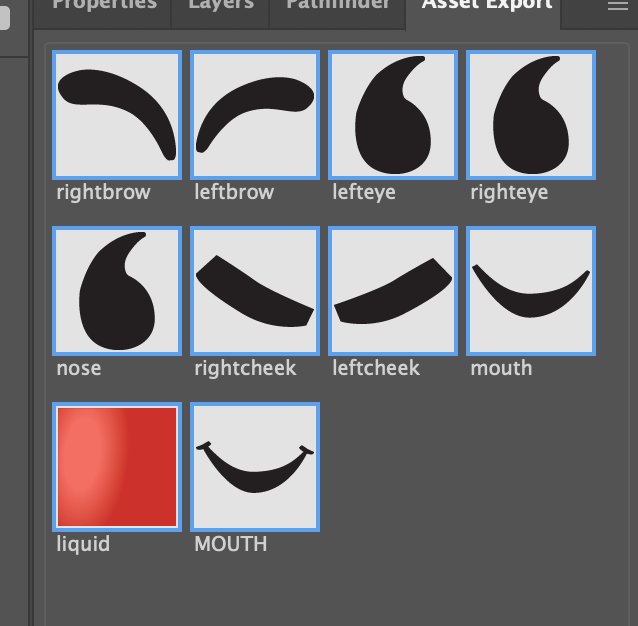
For the fifth and final pattern, I decided to animate the Kool-Aid man. In Illustrator, I traced over an image of the Kool-Aid man to get the features of the face and their placements right. I then made a red square and added a circular gradient as a highlight.
I wanted the animation to be a glass filling up with Kool-Aid using the red square, and then have the face be revealed as it fills up. The face would have a sort of floating animation as if it were inside the liquid itself. The Kool-Aid man would then wink and the liquid would go back down to restart the animation loop.
I watched a few tutorials on how to animate the liquid. I initially started with a mask-reveal animation, covering the red square with the mask and having it reveal. I used the curve handles to make it look like the liquid was sloshing side to side as it rose, but I wasn’t satisfied with how it looked. I then found a tutorial on how to use the wave warp effect. I used that and just animated the square moving up and then down. I also warmed the right eye to make it look like it was blinking. To get the floating animation for the face, I reused the jitter effect from the moving words project and slowed it to make it look like they were floating instead of shaking. Other than learning how to use the effects, I think this was the easiest pattern.
I like this project a lot, as I got to use and experiment with different techniques and effects for each pattern. And since they were looping animations, they were pretty easy and short to make, even more so when I knew what I was doing. Most of the time was spent adjusting timing, which was annoying since I had to constantly playback animations to see what worked and what didn’t.